- Back to Home »
- Graphic Design typographi and Advertisement »
- 2 grt GRAPHIC DESIGNERs of the century & Happy new year 09
 Happy new year 09
Barney Bubbles: Optics and Semantics

Barney Bubbles has a unique place in British graphic design. Even more than Robert Brownjohn, who also died much too soon, Bubbles feels both known and unknown. If only we could interview him now we could finally get some answers. Why refuse to sign your designs when you knew they were so original? Why the repeated desire for anonymity when your work sometimes includes stylized self-portraits, a blatant assertion of your presence on equal terms with your clients, in a way that most of your colleagues in graphic design would never have dared at the time? Bubbles’ suicide in 1983, at the age of 41, ensured that we will probably never get to the bottom of it. Only one hesitant interview with him exists, reluctantly undertaken and published in The Face two years before his death.
Colin Fulcher (aka Barney Bubbles). Photograph by David Wills, 1966


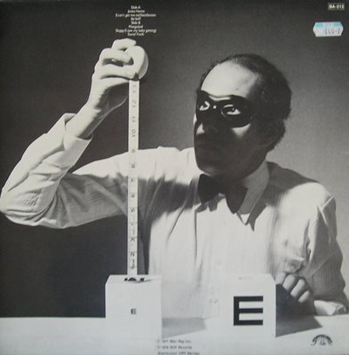
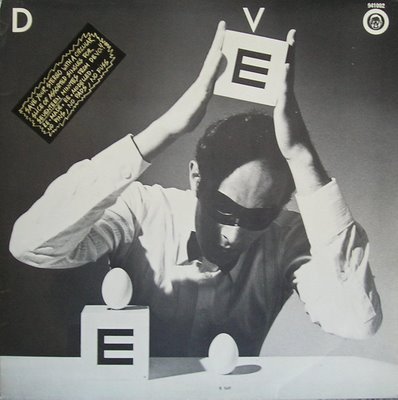
Hi folks. Not sure of the details on this Devo cover, I know it is Griffin and Barney’s work, but beyond that I’ll rely on the legions of Barney Irregulars to fill me in.
I was directed to the source of these great works by AlphaInventions who told me of a French speaking person, Vivon, whose address is:
http://vivonzeureux.blogspot.com/2008/12/devo-be-stiff.html,

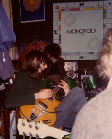
Funky Paul reports from deep in Ladbroke Grove, March 1970, at 307 Portobello, with Barney on guitar at left. What chord is Barney fingering on what Paul thinks is an L5? Paul’s painting of the Monopoly board on the wall.

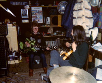
Barney laughing at right at 307 with John Rewind, 1970. Rewind is playing the guitar named, “American Pickle,” a 335 that Funky Paul painted for him at Funky Features in the Haight Ashbury (on Central where the Church of John Coltrane would later be) just before he left for England to arrive on December 21, 1969.
Robert Brownjohn the most innovative graphic designer

Robert Brownjohn at the Institute of Design,
© Eliza Brownjohn
Combining audacious imagery with ingenious typography, illustration and found objects, ROBERT BROWNJOHN (1925-1970) was among the most innovative graphic designers in 1950s New York and 1960s London, where he designed titles for James Bond films, graphics for the Robert Fraser Gallery and artwork for the Rolling Stones.


Watching Words Move, 1959
Experimental typography booklet
Brownjohn, Chermayeff & Geismar
© Eliza Brownjohn
Throughout his life Robert Brownjohn loved music. Many of his closest friends were musicians and his most playful and inspiring work was related to music. When it came to designing an album cover for the Philadelphia Orchestra in 1958, he fused his love of music and of typography by transforming blocks of disused wooden type and wooden bricks from his daughter Eliza’s playbox into a striking graphic composition which is also a commentary on the process of typographic production.

Obsession and Fantasy, 1963
Poster for the Robert Fraser Gallery, London
Robert Brownjohn
© Eliza Brownjohn
He did so by replacing the orderly arrangement of type by a skilled typesetter with a higgledy-piggledy collage of wooden blocks. The type on the sculpture runs from right to left, and, to make it legible, the photographic image was reversed. Witty and intriguing, the wooden collage typifies the intellectual rigour and underlying humour that characterised Brownjohn’s work. It also demonstrates the appreciation of the everyday objects that tend to be taken for granted that he had inherited from his teacher László Moholy-Nagy at the Institute of Design in Chicago during the 1940s.


Brownjohn and Margaret Nolan on the set of Goldfinger, London 1964
Photograph by Herbert Spencer
© Mafalda Spencer
Famed for his flamboyant lifestyle as well as for the quality of his design ideas, Brownjohn was an influential figure in graphic design in both 1950s New York and 1960s London before his untimely death of a heart attack in 1970 a few days before his 45th birthday. In his audacious choice of images – from the bare breasts on a poster for Robert Fraser’s Obsession exhibition, to the gold-painted female torso in his Goldfinger titles – Brownjohn captured the experimental spirit of the 1960s by introducing the progressive ideas of Moholy-Nagy to popular culture in inspired juxtapositions of type and image.

Rolling Stones, Let It Bleed, 1969
Album cover – front
Photography by Don McAllester
Robert Brownjohn
© ABKCO Music & Records, Inc
Born in New Jersey in 1925 to a British-born bus driver and his wife, Brownjohn’s artistic talent was encouraged by a teacher at his New Jersey high school, who helped him to win a place at Institute of Design in Chicago. Arriving there in 1944, Brownjohn became a protégé of Moholy-Nagy, the Bauhaus émigré who had founded the new Bauhaus, as the Institute of Design was first named, as a modernised version of the original Bauhaus in Germany. “The goal is no longer to recreate the classical craftsman, artist and artisan with the aim of fitting him into the industrial age,” opined Moholy-Nagy. “By now technology has become as much a part of life as metabolism. The task therefore is to educate the contemporary man as an integrator, the new designer able to evaluate human needs warped by machine civilisation.”

Despite the financial and administrative difficulties of the Institute of Design, it was a stimulating place to study and Moholy-Nagy was an extraordinarily inspiring teacher. Fired by the belief in “the interrelatedness of art and life”, Moholy-Nagy was intent on liberating modern design from commerce and infusing it with social and spiritual purpose. Determined to produce thoughtful and intellectually open students, he organised lectures on mathematics, science, philosophy and literature as well as art, design and film. Gifted and engaging, Brownjohn was among the most receptive students. For the rest of his life, his work bore many of the formal influences of Moholy-Nagy and he remained intellectually inquisitive, an avid reader with a love of film and music, particularly jazz, a passion he acquired in the clubs of Chicago’s South Side.

Stationery for Michael Cooper
Robert Brownjohn
After Moholy-Nagy’s death in 1949, Brownjohn forged a similarly close rapport with his successor, the architect Serge Chermayeff, who appointed him as an assistant. Brownjohn combined his teaching at the institute with freelance design assignments and a stint at the Chicago Planning Commission as an architectural planner.
In 1950 Brownjohn moved to New York and spent several years financing a drug-infused, jazz-club-based social life with freelance employment for clients such as Columbia Records and the American Craft Museum. He forged friendships with the musicians Miles Davis and Charlie Parker, and the artist Andy Warhol. Brownjohn only settled down when he married Donna Walters in 1956 and, the following year, teamed up with fellow designers Ivan Chermayeff, Serge’s son, and Tom Geismar to form Brownjohn, Chermayeff & Geismar.

Poster for Nagata & Brownjohn Ltd., 1960s
Robert Brownjohn
Renowned for its industrious but informal atmosphere, BCG began by designing book jackets, album covers and letterheads, but soon won more substantial commissions, often through Chermayeff’s architectural connections, including the US Pavilion at the 1959 Brussels World’s Fair. There they created a Streetscape inspired by their love for the vernacular graphic imagery of the New York streets by filling part of the pavilion with a three-dimensional streetscape. Many of the signs and symbols in the streetscape were found on exploratory outings to Coney Island with fellow graphic designers such as Tony Palladino and Bob Gill.
Among BCG’s most important corporate clients was the Pepsi-Cola Company, which commissioned Brownjohn to design the 1959 Christmas decorations for its imposing new headquarters designed by the architects Skidmore, Owings & Merrill on the corner of Park Avenue and 57th Street. He created a spectacular over-sized ripple of Christmas tree baubles that filled the lobby and drew crowds of admirers on the pavement outside, day and night. Elaborately constructed from multi-coloured baubles embedded in an armature of chicken wire, the decoration formed a giant wave supported by pilotti to curl like ribbon for the full length of the lobby.

Poster for the New York Peace Campaign, 1969
Robert Brownjohn
© Eliza Brownjohn
Brownjohn and his colleagues combined their commercial projects with experimental work, such as Watching Words Move, a series of typographic jokes inspired by the games they played during quiet moments in the studio, when they amused each other by constructing visual jokes from words and symbols. They pasted carefully selected letters and words by hand into this booklet in The Composing Room, the experimental typesetter used by BCG and other leading New York graphic designers of the era.
By the end of 1959 Brownjohn’s drug habit had caught up with him; BCG disbanded in 1960 and he moved his family to London hoping to benefit from the UK’s liberal approach to drug use.
His arrival in London was perfectly timed for the city’s fledgling graphic design scene, which was energised by the addition of US designers like Brownjohn and Bob Gill. Urbane and impeccably connected, he played an important role in making graphic design a glamorous profession and in commercialising modernist graphic concepts.
After spells at the advertising agencies J. Walter Thompson and McCann-Erickson, Brownjohn formed a film company with the producer David Cammell and director Hugh Hudson. His leap from print to moving image appeared effortless and bore the influence of László Moholy-Nagy. Simple, yet spectacular, Brownjohn’s first film sequences, the titles for James Bond’s From Russia With Love and Goldfinger, took audiences by storm. Moholy-Nagy had experimented by projecting light on to clouds; Brownjohn took this idea to the mainstream by projecting on to women’s faces and bodies.
As in New York, Brownjohn excelled at conceiving brilliantly simple graphic ideas, and executing them without frills or fussiness. In a poster for the Robert Fraser Gallery he used the nipples of a model’s breasts to represent the Os in the exhibition title, Obsession. The last work he completed before his death in 1970 was the Peace poster in which an Ace of Spades card is pasted between the hastily scrawled letters P and E, and a question mark.
BIOGRAPHY
1925 Born in Newark, New Jersey as the third child and only son of Herbert Brownjohn, a British-born bus driver, and his wife Anna.
1943 After graduating from the Arts High School in Jersey City he studies at the Pratt Institute in Brooklyn.
1944 Enrols at the Institute of Design in Chicago, where he studies under the Bauhaus émigré László Moholy-Nagy, who publishes one of Brownjohn’s student projects in his 1947 book Vision in Motion.
1946 When Moholy-Nagy dies, Serge Chermayeff becomes director of the Institute and appoints Brownjohn as an assistant.
1948 Joins the Chicago Planning Commission as an architectural planner.
1949 Returns to the Institute of Design. Within the US design community, his friends include R. Buckminster Fuller, Marcel Breuer and Mies Van Der Rohe.
1951 Moves to New York, where he works as a graphic designer for the furniture designer George Nelson.
1953 Works briefly at Bob Cato Associates and teaches at Cooper Union and Pratt Institute, while designing freelance for Columbia Records, The American Crafts Museum and Pepsi-Cola.
1956 Marries Donna Walters and their daughter Eliza is born. Designs the American Jazz Annual for the 1956 Newport Jazz Festival. His New York circle of friends includes Miles Davis, Charlie Parker, Stan Getz and Andy Warhol.
1957 Co-founds Brownjohn, Chermayeff & Geismar with Ivan Chermayeff and Tom Geismar, where he continues to design for Columbia Records and Pepsi, while working on corporate identities and exhibition design projects including the US Pavilion at the 1958 Brussels World's Fair.
1960 Leaves New York and Brownjohn, Chermayeff & Geismar to move to London, where he becomes a creative director of the advertising agency J. Walter Thompson.
1962 Joins a rival agency McCann-Erickson. Donna leaves Brownjohn by moving to Ibiza with Eliza.
1963 Designs the title sequence for the James Bond film From Russia With Love. Begins a relationship with the fashion designer Kiki Milne.
1964 Creates the titles for the James Bond film Goldfinger.
1965 Works with the film makers David Cammell and Hugh Hudson, with whom he founds Cammell, Hudson and Brownjohn. Begins work on the five year series of ‘Money Talks’ cinema commercials for Midland Bank.
1966 Creates the titles for The Tortoise and the Hare film, directed by Hugh Hudson, for Pirelli tyres.
1968 Designs the artwork for the Rolling Stones’ album Let It Bleed. Plays a cameo role in Dick Clement’s film Otley.
1969 Cammell, Hudson and Brownjohn disbands and he forms Nagata & Brownjohn with the Japanese-American director David Nagata. Plays a cameo part in Dick Fontaine’s film Double Pisces, Scorpio Rising. Designs the Peace? Poster.
1970 Robert Brownjohn dies in London of a heart attack. Bob Gill organises a memorial service at the US Embassy in London.

Typography by Barnbrook Design, 2008
Jonathan Barnbrook works as a designer and typographer in London. A monograph on his work, The Barnbrook Bible, was published in 2007.


I have read this blog it has full information about Adelaide Graphic Designers. For more such type of information, Kindly Visit: http://www.taketheleap.com.au/