- Back to Home »
- AMAZING Design , Architectural DESIGN »
- Illusions!!! Oh no its Architectural Designs!!!
As architects struggle to balance aesthetic appeal with practical considerations, many are finding the best way to create bold, interesting, even mind-bending features is through the use of optical illusions. In effect, our own eyes are being used against us - and nobody’s complaining about the results!
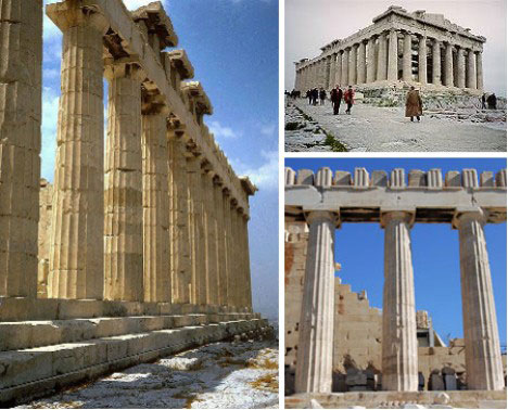
(image via: Sacred Sites)
The use of optical illusions in architecture isn’t new; in fact one of the most outstanding examples is the Parthenon in Athens, Greece, constructed over 25 centuries ago. Curiously, the many subtle techniques (called entasis) used by the Parthenon’s architects don’t make the structure look like something it isn’t - instead, they correct the viewer’s perceptions so that the temple looks as it should. Slightly wider corner columns, pillars that curve inwards and a floor that is 6 cm (2.4 inches) higher at its center all conspire to give the Parthenon an enduring beauty that is evident even in its current state.
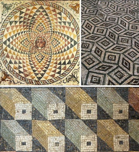
(image via: Allposters)
Architects of the Classic Era worked mainly in stone, and the ancient Romans applied newly discovered knowledge of optics and perspective to create the amazing optical illusion mosaic floors shown above.
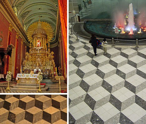
(image via: Travelblog and ASL)
The Middle Ages and the Renaissance saw a rebirth of science, art and design as epitomized in the magnificent paintings of Leonardo da Vinci and Michaelangelo. Their influence was (and is) felt around the globe, as seen in the floor of Saltas cathedral in Argentina (above left) and the painted floor of Tokyo’s Sunshine City shopping center (above right).
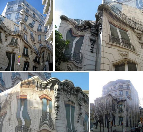
(image via: Patricia’s Palette)
Modern architects often use traditional forms and styles as a starting point, then warp them to create something new that - either amusingly or disturbingly - puts a new twist on what we expect to see. The so-called Melting Building, created by artist Peter Delavie for France’s Athem Co., is actually made from tarpaulins draped over the sides of a Paris building under construction.
(image via: Athem)
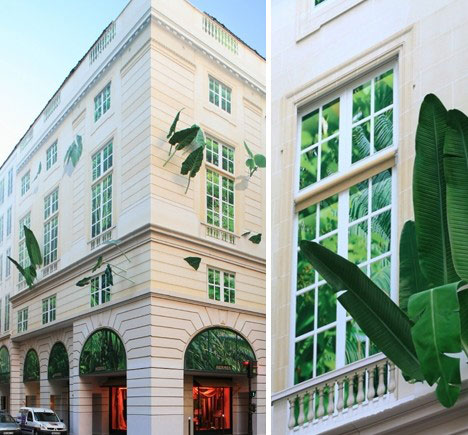
Here is another of Athem’s buildings, this one after completion. A clever mix of inorganic stone and organic greenery softens the sever outlines of the structure while adding a note of whimsy.
(image via: Martin Winer and SquidVids)
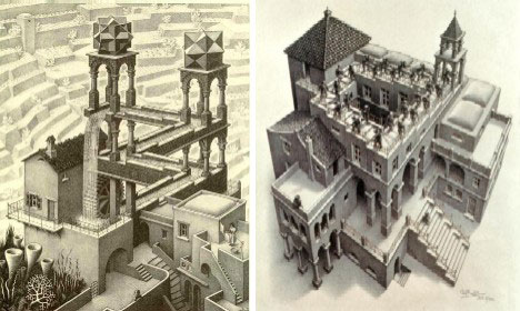
The late M.C. Escher was widely known for his curious paintings and drawings that played with perspective in unusual ways, yet still conformed to mathematical theories. Many of these depicted “impossible” buildings and architecture, with some better known examples shown above.
(image via: New Optical Illusions)
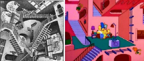
Even The Simpsons have gotten in on M.C. Escher’s act!
(image via: Bergoiata)
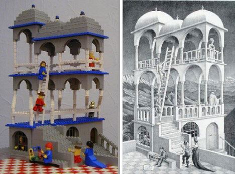
Andrew Lipson is an obvious admirer of M.C. Escher and he shows it in his accurate as possible renderings, in Lego bricks, of many of Escher’s impossible structures such as Belvedere above.
(image via: Uwe Hermann, Enigmatico and New Media Designer)
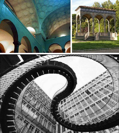
Some architects have taken M.C. Escher’s unspoken challenge and have tried to create actual structures which reflect the late artist’s virtual reality. Examples of these include, clockwise from above: Ludwig Maximilians University of Munich, a pavilion by Aldo Benedetti and this ethereal Stairway to Nowhere - no connection to Sarah Palin.
(image via: Hot Homes of Utah, Point Click Home and Floridahome-rental)
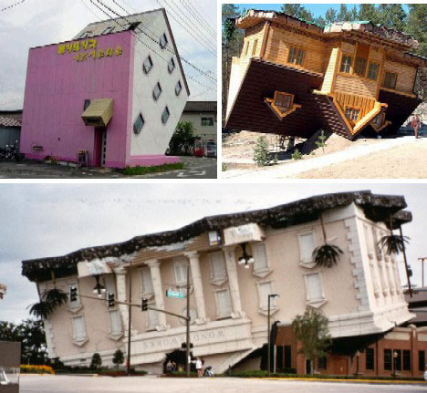
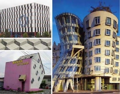
Architects who seek less mind-bending architectural optical illusions simply turn the concept upside down… by turning the building upside down. Above are three examples, one from Japan (left) another from Poland which mocks the Communist era (right) and Orlando’s famous Wonderworks House (lower).
(image via: Prague Experience)
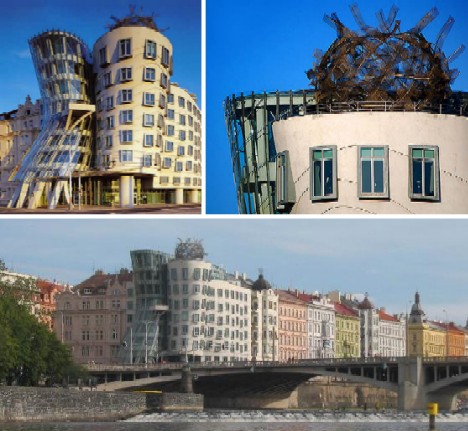
Eastern Europe boasts a surprising number of surprising buildings designed both before and after the fall of the Soviet Union and its associated regimes. One of the most famous is the Dancing House (Nationale-Nederlanden building) in Prague, Czech Republic. Built between 1992 and 1996 and designed by Vlado Milunc and Frank Gehry, the building houses one of Prague’s best restaurants on its top floor and gives visitors excellent riverside views of the city’s historic downtown.
(image via: Roy Lichtenstein Foundation)
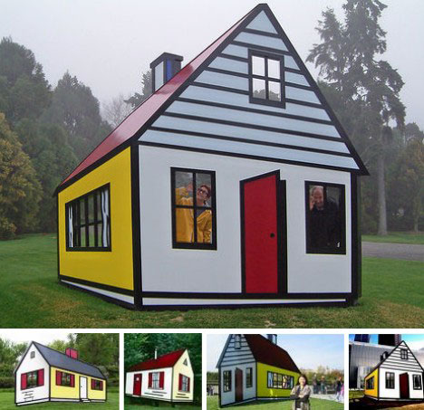
When is a house not a house, even though it looks like a house? If you think you’re confused now, try visiting the Roy Lichtenstein House. There are actually two of these intriguing structures: a fiberglass structure from 1997 located at LongHouse Reserve, East Hampton New York, and a painted aluminum version from 1998 located at the National Gallery of Art’s Sculpture Garden in Washington DC. Here’s a video illustrating what it would be like to walk around one of these odd houses:
The amazing Roy Lichtenstein House!
(image via: MTNWA)
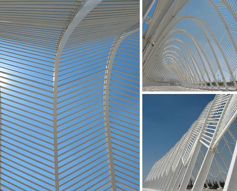
Optical illusion architecture doesn’t have to take the form of a house, building or other such structure, as this intriguing walkway and associated installations in Athens, Greece so eloquently illustrate. Built for the 2004 Summer Olympic Games and designed by acclaimed artist/architect Santiago Calatrava, these structures interact with sunlight to create a complex panoply of light and shadow that fools the eye while soothing the mind.
(image via: Illusion King)
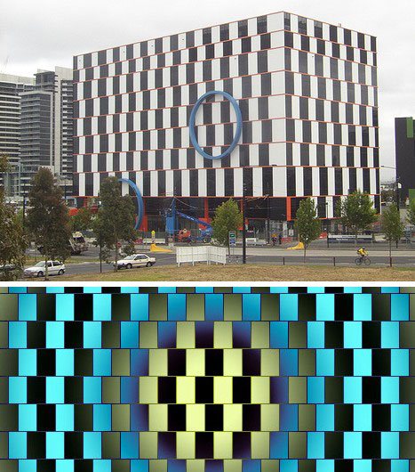
Our final and perhaps finest example of an optical illusion building is the Australian Customs Service building, located in Melbourne, AU, and completed in 2006. Each floor of the building is exactly the same height, yet the tessellation pattern of black & white rectangles separated by parallel orange lines gives quite a different impression. The building was designed to display the so-called Cafe Wall Illusion originally noted in 1979 following the completion of a café in Bristol, England. Hard to imagine enjoying a warm cuppa in the presence of that disturbing pattern!
When it comes down to it, optical illusion buildings allow developers to attract attention without the need for expensive construction techniques. Keeping the eye fooled can keep the bank account - and the buildings - filled.

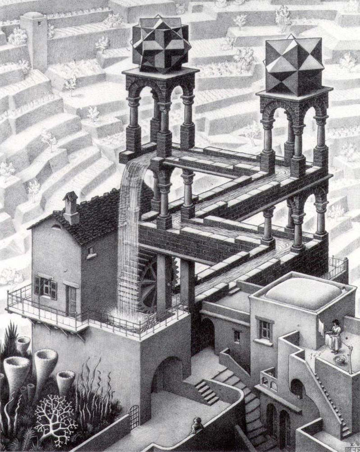
Escher well know for his optical illusion works, mostly in paper, which is very much different from David Copperfield and David Blaine that perform optical illusion tricks. The image above is one of his masterpiece called waterfall.
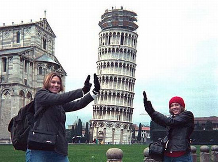
Pictures of people supporting or leaning the Tower of Pisa is a everywhere. Its another type of optical illusion that captures our imagination
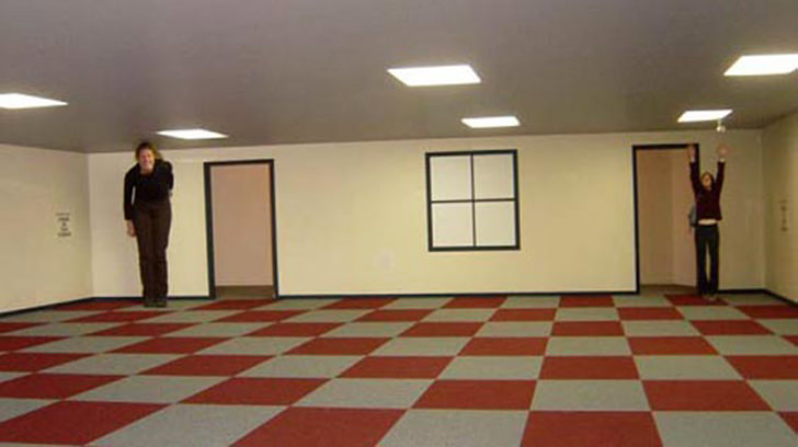
The person standing right in the room appears much bigger then the other standing left. Tricks like these are used in filming the movie Lord of the Rings. Go to frippy’s flickr ablum for examples of optical illusion in a room.
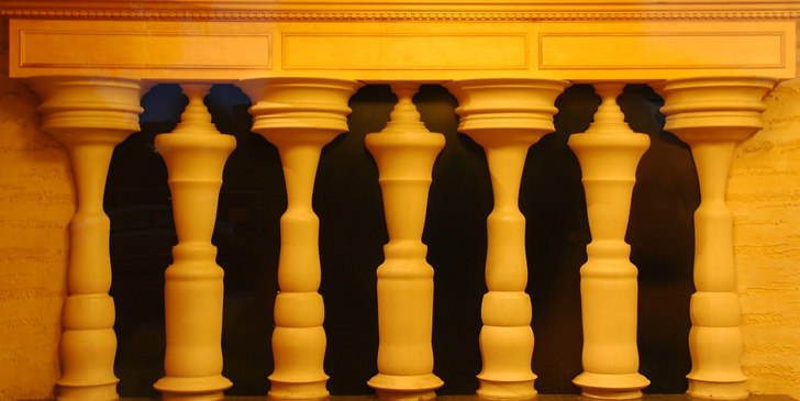
Illusion in architecture is nothing new, what do you see in this picture above? A wall made of stone columns, or do you see siluetes of few guys leaning one to another?
Optical illusions were first used by the Greeks. They built their temples so that the roof was slanted. This gave the illusion that the temple was actually standing straight. They also made the columns bulge so that from a distance they would look perfectly proportioned. In the course of history, people have encountered illusions in many ways. Many of these illusions appear in very common, everyday experiences.
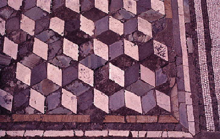
Optical illusion can also be found in ancient floor texture, the image above is an example of pompeii’s pavement. A very good example of optical illusion would be the Library of Celsus was built on a narrow lot between existing buildings. Yet, the design of the library creates the effect of monumental size.
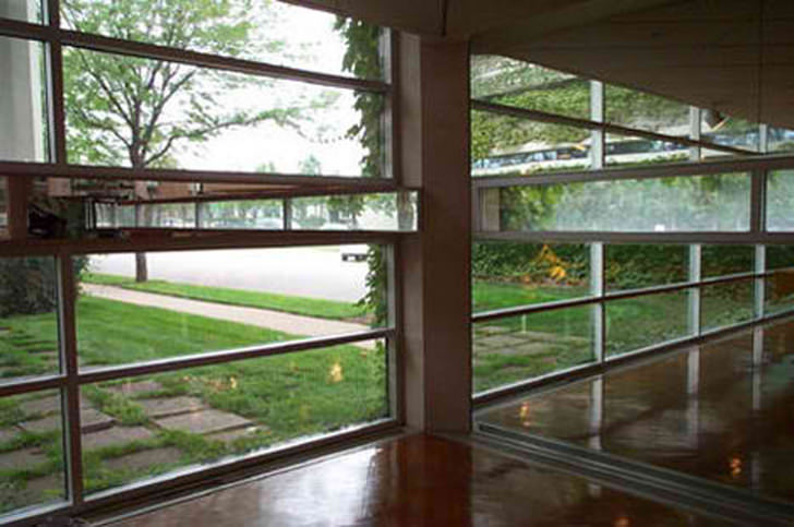
Designing a building requires the architect to play with the idea of optical illusion, creating spaces by fusing two or more spaces. The image above show the horizontal strip glazing between mirror panels turns the corner and becomes the reverse. A confusion of interior and exterior space. Good design tend to blend the interior with the exterior, fusing them together illusionally but not physically.


The so-called El Grifo Mágico, or Magic Tap, may be familiar though it’s more often seen in bars, as a seemingly endless flow from a beer can into a mug. This much larger version looks like something French surrealist Magritte might have painted, perhaps before taking a hot bath.


Artists like Felice Varini like to think big, and this installation is so vast it requires the aid of distance to complete the illusion. “Three Ellipses for Three Locks” in Cardiff, Wales, was completed in 2007 and proves that with a small amount of material - in this case, some yellow paint - something grand can emerge.
The piece is a classic “anamorphic illusion” in that to view Varini’s art as intended, one must be in a certain position where the sightlines can perfectly converge. Costing a mere $50,000, the work was one year in the planning stages yet took only two weeks to create.


Panya Clark Espinal is another artist who, like Varini, plays with perspective to distract and delight. Espinal’s work is showcased at the Bayview station of Toronto’s Sheppard subway line.
Here’s another shot of an Espinal piece in the Bayview station, this time with an obliging human on hand to put the piece into perspective, as it were.



I really enjoyed your blog post, i always got good, relevant and useful information from your new and unique posts, i m sure your blog will keep us continues update.Green Industry Thanks for providing us such useful information.